
Overused Logo Design Trends
Have you ever got turned off from using a company just because you hate their logo and therefore assume that you’ll hate the company as well? I’m sure at one time or another you have, and that’s why it’s so important to make any mistakes when having your logo designed.
Below are seven examples of what not to do with your logo.
1. Watch the spacing.
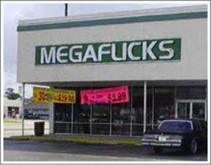
What looks good written down may not work when you get it up on a sign. Take Megaflicks (see example) as a case in point.
It looks fine until you see it up on the sign. Then there is not enough spacing and the wording ends up saying something else.
2. Look at the design from all angles.
Maybe at first and up close it looks good.But take a step back and act like you’ve only seen it at first glance. It’s easy to focus on one aspect and miss the big picture.
3. Overlapping.
Do not let your design and/or letters overlap. It tends to look confusing and chaotic.
4. Make it clear what you are selling.
Try to incorporate something to let people know what your company is about. For example, if you have a spa, it might be nice to have some peaceful, or relaxing type of design. You probably don’t want to have a person playing a sport. Try to let the design give an overall feel for what you are all about without saying too much.
5. Bad association.
You want to make sure that your logo design can’t be mistaken for something else. Look carefully at the overall design and think twice. Take for example London’s 2012 Olympics logo (see example) . People claimed that it didn’t resemble any landmarks and that it brought to mind a “distorted Swastika”. Ouch. Probably not a good thing.
6. Changing TOO much.
If you are in the process of rebranding and you are having a new logo designed that’s great. One common mistake though is to change too much, and then people don’t recognize your company at all. Try to stay at least a little bit the same with your logo. KFC made some rather big changes to their logo, for example, while Google has made hardly any in the three times they have updated theirs.
7. And, lastly, don’t ever use chat bubbles.
Many logos have used this and while they are not distasteful, they are not longer uncommon. It’s also used for so many apps these days that it’s well over-used. They are so often seen now that they are not unique and will not make your logo stand out.