Best Buy Redesigns Logo In Attempt To Stay Alive
Just recently Best Buy decided to give their business a fresh look by redesigning their logo.
Often companies look to improve sales by giving their business a “facelift” and the fastest and easiest way to do that is to update their logo. It gives a an instant “refresh” with a minor amount of change.
In this case, Best Buy has updated their logo and we’re asking you to weigh in on it.
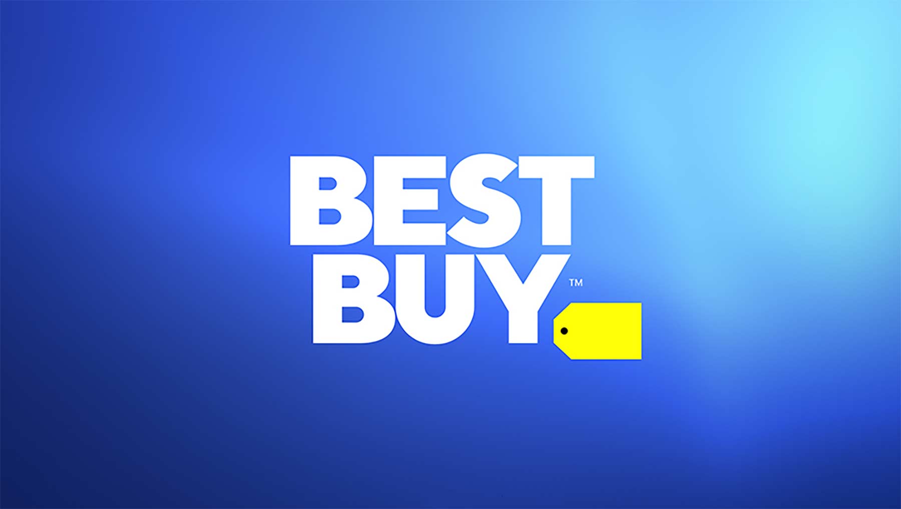
They have chosen to keep their iconic yellow tag, but instead of the wording on the inside, it’s positioned on the outside of the tag. The blue is much brighter, and the lettering is white instead of black. Overall the logo is much more clean, crisp, and clear.
According to Best Buy, “as we focus on enriching people’s lives through technology, we’re expanding what we sell and evolving how we sell it. And now our brand’s evolving, too.” This re-branding is an attempt to keep up with the times, and, as technology updates, update their products, business, and selling techniques as well.
While it is of the utmost importance to keep your company from getting stale, especially when it comes to companies like Best Buy, that deal mainly with technology related sale, we do wonder if they maybe missed out on a slight similarity between their new logo and Bud Light’s. If you don’t know what I mean go check it out. It’s hard to not notice.